Kollektivraum/Sesta Classe. Design and Wine.
In spring 2018, the founding members of the art and culture association ”Kollektivraum’ were our guests – Artists in Residence – in Dogliani Castello. A meeting with the young group of vintners Sesta Classe’ inspired the creative troupe to create a special project. The result – a stylish box filled with 3L best Langhe Vino Rosso – we celebrated in May 2019 in Bregenz and Koblach.
a decisive pressure
sometimes projects demand a certain amount of pressure. deciding on a presentation date gives people the drive to complete the task – and suddenly there is no stopping them, even if the feet hurt, drops of sweat run down the forehead and the arms burn from the silk-screen printing process. a step further, just another step, another coffee and forwards. then, at long last, the eagerly awaited moment arrives.
– finally finished. the deep-seated tiredness has vanished and the deserved euphoria sets in. these are projects you won’t forget.
– projects in which, besides a round, harmonious end product, the greatest treasure is the shared experience. a collective passion that can be found in every phase of this production.
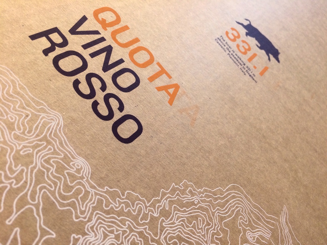
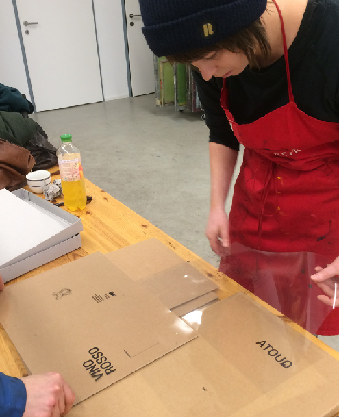
the story of the red wine “quota 311.1” 2018
thoughts that unite
as initiator and coordinator, yvonne amann, from serafina, is the linchpin of this joint project. last year yvonne asked a graphic designer to create a custom packaging design.
once again, it was all about putting our heads together and inspiring each other. ten young winemakers provided a wine with a strong personality and the cultural association serafina, headed by yvonne amann, was the initiator, coordinator and organiser of the project.
the designers lena seeberger and sarah mistura created this box and crafted it by hand. the two are part of the kunst- & kulturverein KOLLEKTIV in bregenz – its purpose is to support artists and to put them in contact with each other.
complex design
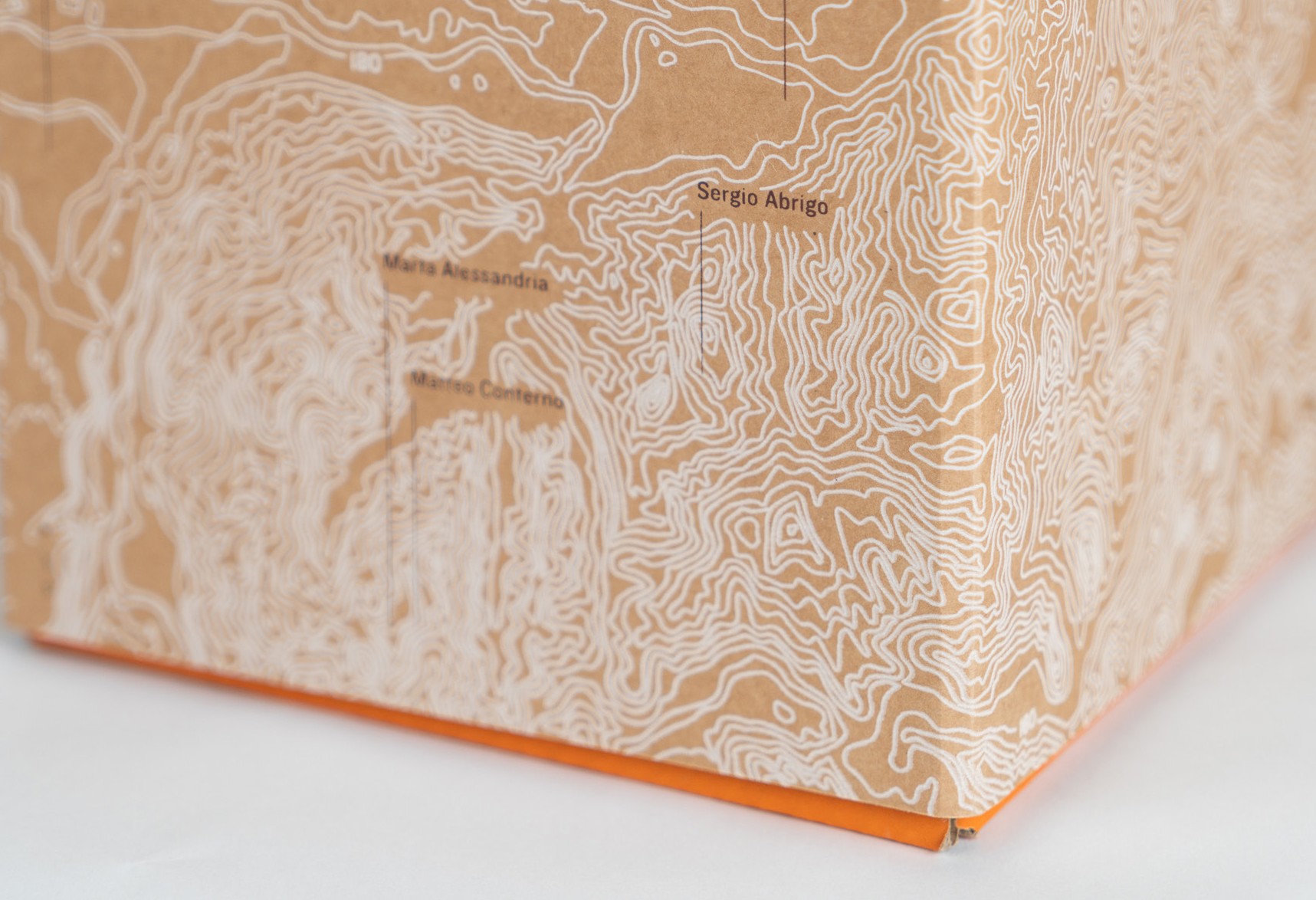
we started where all high-quality products start – with a particular attention to the production and a well planned design. intertwined paths run through the lush landscape of piemont. a unique, rhythmic environment that is not only reflected in the rippling pleasure of the wine.
its topography is like the fingerprint of the landscape – the contour lines drawn on the packaging give us an idea of this rich diversity.
from the lovingly matured wine to the exhausting, individualised production of the packaging – in every phase you can find pure passion.
in this uniquely developed packaging system, the focus is on the youthful freshness, representative of the ten young winegrowers who created this wine – unobtrusive and surprising.
this box is quickly packed and the tap fills several glasses in no time at all. so this package in bright orange, made with a lot of care for the details, invites you and your friends to refill and to use it again.
this special packaging is above all one thing – an invitation to enjoy being together. because only sharing this moment brings the multi-layered richness of this wine to life.
production with ups and downs
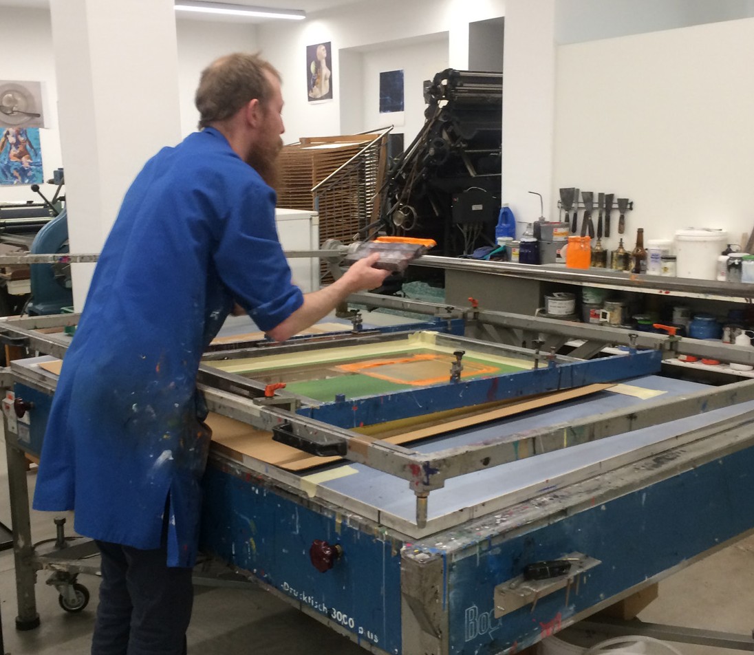
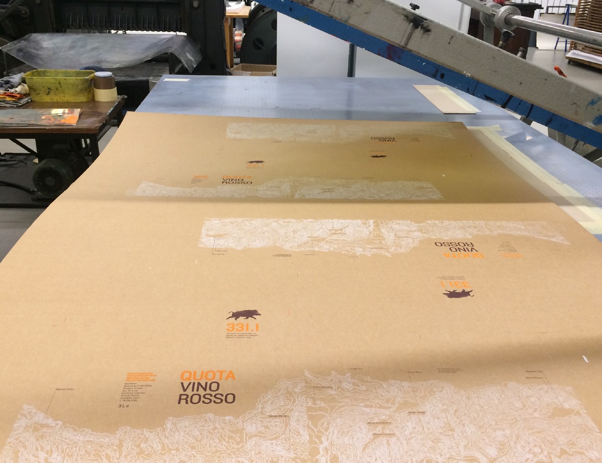
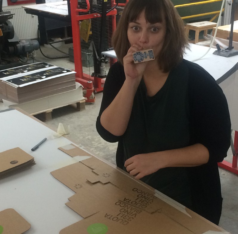
the cardboard box was lovingly handmade and printed with a lot of hard work in lustenau (at). every wine box is unique due to the screen printing process – not every item is perfect and it shows the loving handwork behind the scenes. surrounded by vintage printing machines for relief engraving and intaglio, the scent of oily colours and the bright neon tube light, our first step was to create the orange under box. in group of two and with a lot of labour the screen printing squeegee was moved back and forth about 400 times. it was all about holding on and persevere, because a break would let the colour dry on the screen. so we went on and on and on. after three hours the last carton was printed, the screen was washed and, finally, it was time for a well-deserved break.
but the hardest part was still ahead of us. the top box, printed with three colours. at the beginning of the first night of printing it, we were still optimistic and believed that we could be able to do everything in one go. far from it – we only managed to print half of the cartons with the white ink. at six o’clock in the morning we gave up – completely exhausted and with sore arms. we needed a break.
we realized that, if we didn’t start early, we would have to go through another night like that. so, after just a few hours of sleep and recovery, we went back to the machines. at first the motivation was low, because the night before was still weighting on us, but with the first pressing of the colour through the screen and onto the rough cardboard the enthusiasm came back unhindered.
the sweat ran down the forehead once again and the feet hurt even more than in the night before, but we were well-coordinated, every move was successful, every step and movement with the squeegee were precisely done.
washing the screen after each colour was done was a welcome change. and above all, it was a break. finally a moment to relax and to take a deep breath – and to discuss the situation.
how long will it take? best not to think about it – just continue, continue, and finish. that’s what we did. at three o’clock in the morning we were ready, the last box in our hands – we were very happy.
then it was all about tidying up, cleaning and washing the screen. suddenly there was a loud sound – the screen was torn. that something like that would befall us! but luckily it happened after we finished printing the 130 sheets.
the final step, the cutting and folding of the sheetswas finally carried out in a printing plant and machines replaced our physical labour – that would have been too much.
instead of red wine, white wine and instead of silk-screen printing, stamp printing. in the last week before the presentation of the wines, high pressure was applied for the design and the creation of the white wine boxes. It’s all about speed and, once again, the belief that everything will somehow come together in the end. and just like with the red wine box, it’s the people who stand beside you when you need them, with advice and with actions, who make such projects so very special. many heartfelt thanks to everyone involved – without you, this box would not exist.
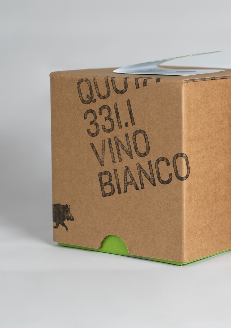
minimalist monochrome design
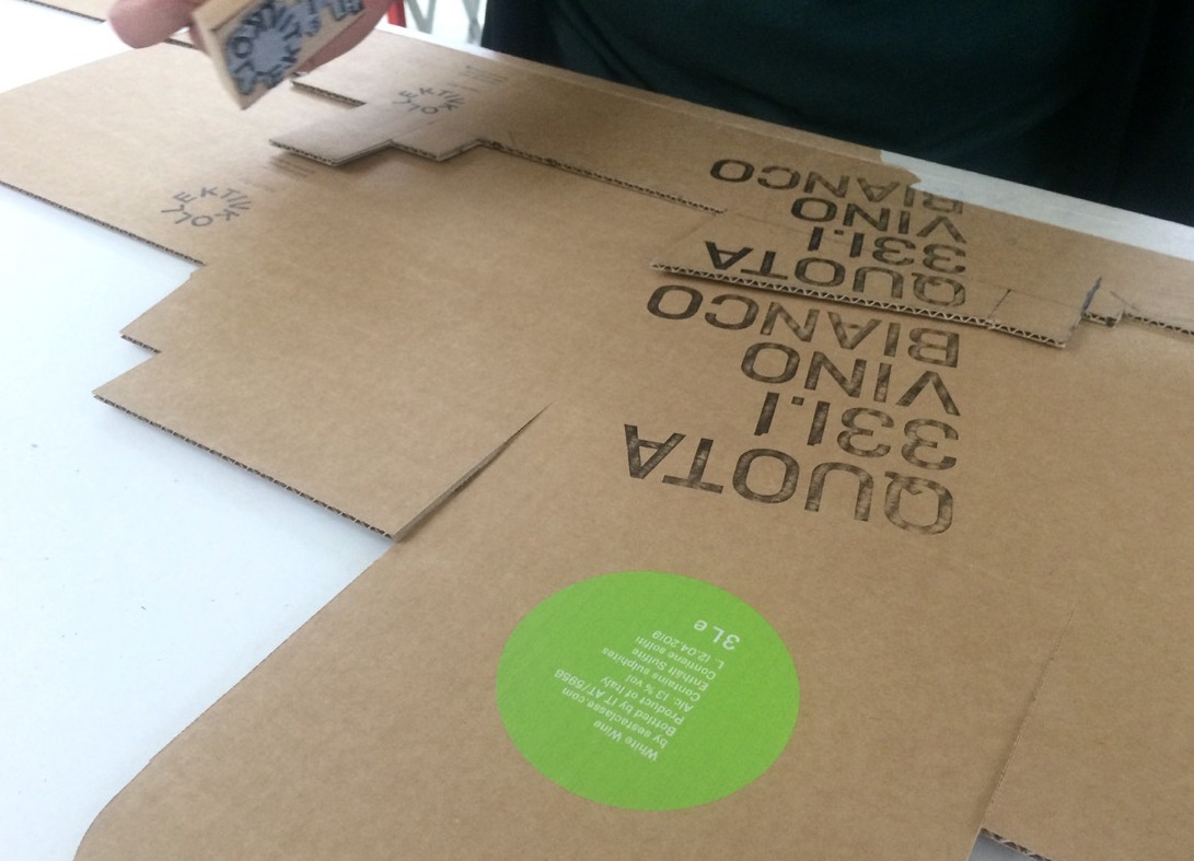
it had to be quick and easy to make. since the white wine isn’t made by exactly the same people who made the red wine, it wasn’t right to simply change the colour and adopt the design of the red wine boxes. another idea had to be found. at short notice rubber stamps could work very well – they can be made quickly and anyone can use them without any prior knowledge or practice. that was the idea – four rubber stamps and a black ink pad. so stamps were ordered without delay. stamping gives the motifs a special handmade character. This essential design is complemented by green accents. the green under box, the booklet, the boar, as well as the typography make a visual clip to the red wine box. these are two different designs that show similarities and yet feel different.
the last minute production
it had to be done quickly. it was already sunday afternoon, on the next friday the presentation of the wine would take place and yet we had not even an inkling of an idea for the white wine box. Then, suddenly, the longed-for, brilliant stroke of genius came: to work with rubber stamps and digital printing. The aesthetics were similar but not the same, the production was manageable – the perfect complement to the red wine box. the stamps were ordered on monday morning and delivered the following day. it was resolved swiftly and we calmed down tremendously – because of course we also needed time to stamp the 80 boxes by hand. the print file for the green areas of the box had also to be finalised quickly on monday, so that the print shop could take care of the digital printing and cutting of the upper and lower parts of the box. The material had to be ready for stamping on wednesday. everything went well and according to plan – the stamps were there, the printed cardboards were finished – then all we had to do was to roll up our sleeves and start stamping. wednesday was the appointed day. but the stamping had also to be done carefully – there was still a lot that could go wrong during the process. what we needed was a template. well-made templates can save you a lot of time. the placement of the stamps didn’t have to be guessed every time and so the 80 boxes could be finished rapidly – no sooner said than done.
with the template, the rubber stamps, lots of water and some snacks we went to the print shop where the printed and cut boxes were already waiting for us. there we first had to set up the place and then we made a test sample – very good, we were relieved, because it came out quite well. a lot of energy was needed to complete everything, but the result was really impressive. we experimented and developed techniques – the big stamp behaved differently than the small ones. quickly the favourite stamp became the kollectiv one. it didn’t require a lot of effort, because it didn’t have a lot of black surface and was quite filigrained. slowly the palms of our hands began to burn. they were red and pulsating. however, we were already halfway done, so it was definitely time for a break. we were a little surprised we made such rapid progress. after the experience with the screen printing of the red wine boxes, we were prepared for the worst – of course stamping is faster, but the experience was still felt deep in our soul. after a good three hours we finished the 80 boxes and could pack everything. we were relieved and eagerly looked forward to the fresh water from the tap to finally cool down our burning hands.
KOLLKTIVraum
kollektiv-raum.org
concept, layout: lena-seeberger.com & agenturrosa.com
text: astrid neumayr & lena seeberger
fotos: sara mistura
sesta classe – winemakers: gabriele calvo, davide mortara, danilo amerio, riccardo toso, ettore bosio, marta alessandria, matteo conterno, luca boasso, pietro giachino.